
Considering I said to myself last year I was going to be more proactive with this blog, I've pretty much fallen flat when it comes to thinking of content to write about. However cathartic it may be, I don't want to write just for the sake of writing, but whilst I was out and about earlier today I thought it might be useful to start a weekly feature about inspirational work and objects.
Each Sunday, I'm going to put together a post that focuses on something I've come across that I find interesting and thought provoking in the hope of working elements into my own practice, as well as introducing people to something potentially new.
This morning I came across a post on Twitter from the British Museum featuring an object from their collection (though sadly they aren't on display) and I immediately fell in love with it. As a child I was always fascinated with horology and the intricacy of clockwork. So for the first instalment of the Sunday Inspirations blog, I'd like to introduce you to the Astrolabe.
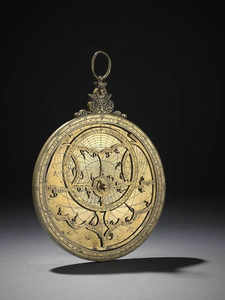
Front view of the one of Georg Hartmann's astrolabes from the British Museum's collection. Dated 1532.

Rear view focusing on the rete and rule.
Photographs courtesy of the British Museum.
An astrolabe (Greek for star-taker) is a very elaborate inclinometer, historically used by astronomers and navigators, to measure the inclined position in the sky of a celestial body, either during the day or at night. It can be used to identify stars or planets, to determine local latitude given local time and vice versa, to survey, or to triangulate. This is done by drawing the sky on the face of the astrolabe and marking it so positions in the sky are easy to find. They are typically made up of a disk, called the mater (mother), which is deep enough to hold one or more flat plates called tympans. A tympan is made for a specific latitude and is engraved with a stereographic projection of circles denoting azimuth (the horizontal angle or direction of a compass bearing) and altitude and representing the portion of the celestial sphere above the local horizon. The rim of the mater is typically graduated into hours of time, degrees of arc, or both. Above the mater and tympan, the rete (which represents the sky and functions as a star chart), a framework bearing a projection of the ecliptic plane and several pointers indicating the positions of the brightest stars, is free to rotate.
To use an astrolabe, you adjust the moveable components to a specific date and time. Once set, much of the sky, both visible and invisible, is represented on the face of the instrument. This allows a great many astronomical problems to be solved in a very visual way.
Interestingly, the first mechanical astronomical clocks were influenced by the astrolabe; in many ways they could be seen as clockwork astrolabes designed to produce a continual display of the current position of the sun, stars, and planets. Many astronomical clocks, such as the absolutely gorgeous clock at Prague, use an astrolabe-style display, adopting a stereographic projection of the ecliptic plane.
I want to focus specifically on the work of the German maker Georg Hartmann (1489-1564) and his stunning brass astrolabes from the mid-1500s, some of which reside at the British Museum.
The ones pictured above were designed by Hartmann in 1532. This specific object is a Planispheric astrolabe, meaning it shows the stars at a particular time and place. It is set to a latitude of 50 degrees so can be used successfully throughout the British Isles and similar latitudes.
As I mentioned earlier, astrolabes are made up of several disks. In this case, there are three plates marked on both sides with circles for the tropics and the equator, and almucantars (a circle on the celestial sphere parallel to the horizon) for every three degrees. The azimuths are labelled for every ten degrees. They further bear markings for the unequal hour curves, numbered in Roman numerals clockwise I to XII (additive form for 4, i.e., IIII), and the astrological houses in the manner of Regiomontanus, numbered in Arabic numerals 1 to 12 anticlockwise.
You can just about see the inscriptions on the reverse in the photograph above, but they are beautiful. It's hard to picture the scale of them, but just to try and give you a little perspective, the astrolabe I'm writing about is 140mm in diameter, so that would make the numerals roughly 4-5pt if you compare it to standard type sizes.
I realise there's quite a lot to take in here, so I apologise for the sheer volume of stuff but I find them incredibly interesting! When I was at the V&A in December, I came across some illustrations that were based on cartography from the Middle Ages by the artist Kristjana Williams, so on the back of that, I'd like to try and base some personal work on the text styles from the astrolabes and linking it to Williams' work to maybe create something related to the star charts...


